
Our outline Spark
The outline Spark is only used at Division Level. It is very dynamic, and its position and size follow just a few basic rules. This gives you maximum flexibility and enables you to develop impactful layouts according to your needs.
SPARKUsage
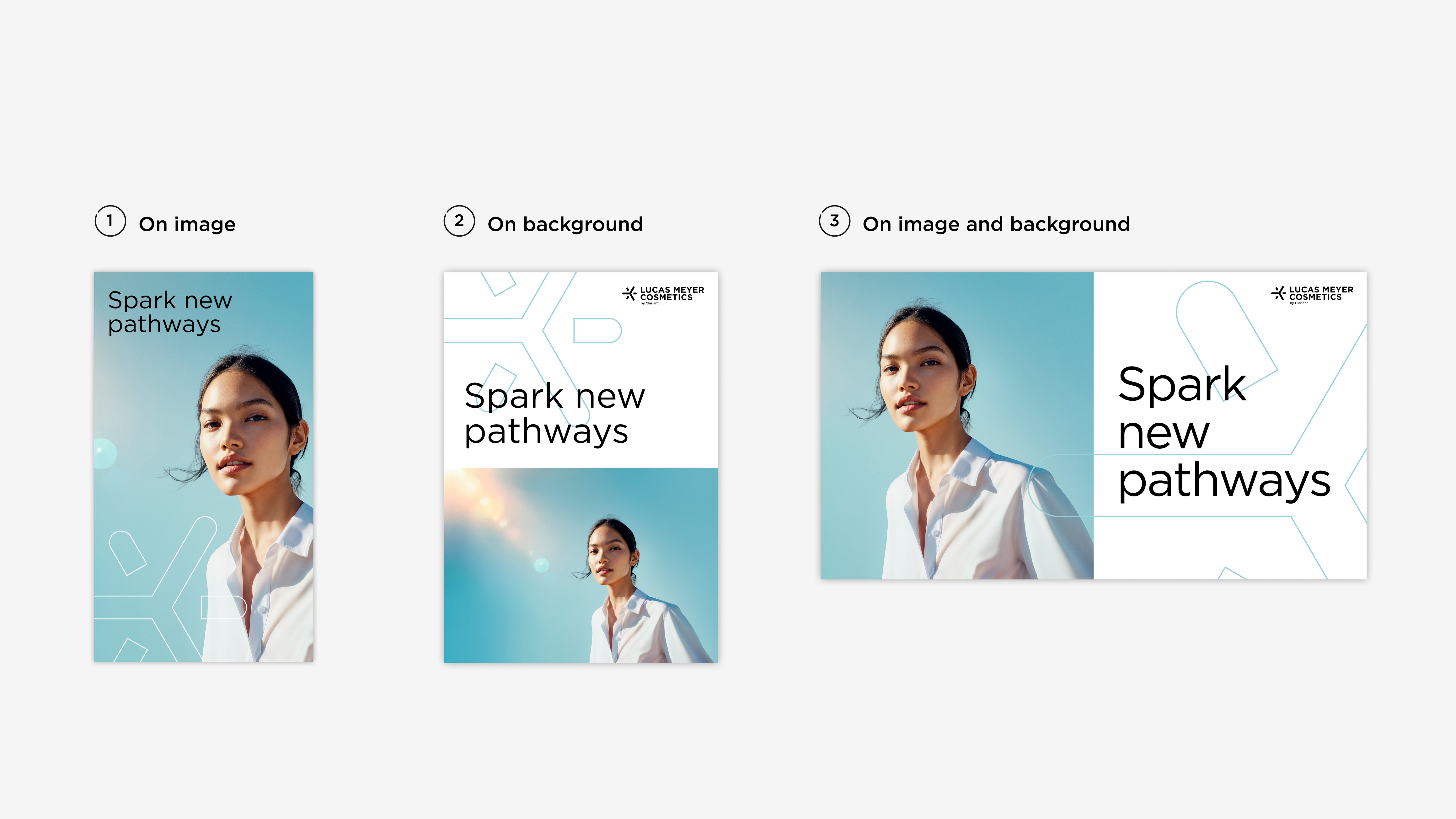
In the layout, your content is hero. The outline visual is an optional design element. The outline visual can be used in white or turquoise (Turquoise 02). Make sure it has enough contrast to the background or the headline.
SPARKColor, size, position and line width
The Spark is available in white or turquoise (Turquoise 02).
Use the Spark in sizes greater than 3 × 3 cm or 100 × 100 px.
The line width depends on the format. You can choose a line width from 1 to 4 points (pt) or pixels (px). Keep in mind that it should be visible but shouldn’t overload the design or draw attention away from the content or the image.

SPARKLayout options
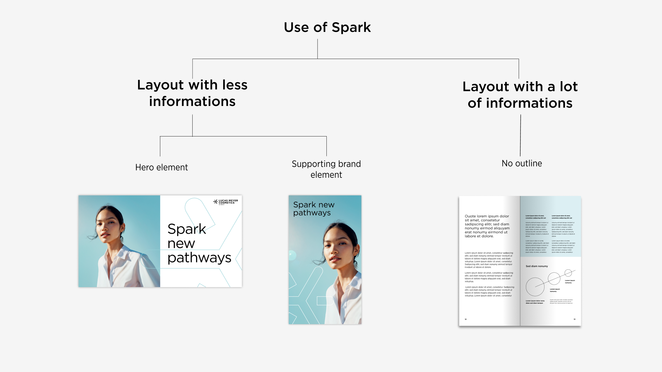
The decision tree below helps to make a decision for the usage of the Spark in the layouts. Try to avoid “over-branding”. If the brand needs to appear multiple times (e.g. on surfaces of a trade fair), use the Spark as well. The Spark is only used on the Division Level.
SPARKDon’ts
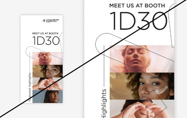
Don’t place the Spark on the cover or inside pages if they are already very detailed. The Spark needs space to be effective.

Don’t use too thick outlines.
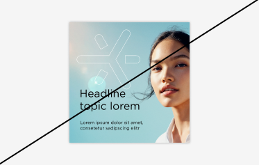
Don’t place the Spark in the format without it being cut by the edge of the format. The Spark must always be positioned cropped.

Don’t position the Spark over faces or typography.

Don’t mirror or rotate the Spark.

Don’t create patterns with the Spark.