Clariant Releases ColorForward™ Interiors 2015, Forecasting Trends and Colors for Fibers and Textiles
- Reveals color palettes to inform and inspire designers, architects and manufacturers
- Four global societal trends identified by panel of color experts
- Bright hues united with mid-tones to capture emotions of a complex modern world
Muttenz, March 5, 2014 – Clariant, a world leader in specialty chemicals, has released ColorForward™ Interiors 2015, the second annual color forecasting guide for producers of textile yarn and filaments, and designers and manufacturers of textiles, upholstery and carpeting. This unique creative tool from Clariant ColorWorks® defines four trends that can be expected to attract consumer attention in the next few years and creates a color palette that can help marketers tap into the emotions behind those cultural currents.
“As a natural element, color has the power to transcend and translate cultural, political, religious and social influences. As a tool, it has the power to communicate emotions and stories as succinctly as possible. And it acts as the ideal marketing driver to steer consumers’ purchasing choices for the future,” comments Judith van Vliet, Designer at ColorWorks Europe/IMEA.
ColorForward Interiors is derived from Clariant’s groundbreaking ColorForward program, now in its ninth year. ColorForward springs from the minds and experience of color, design, marketing and polymer experts, representing multiple creative industries from all over the world. ColorForward Interiors is produced in collaboration with the Clariant Masterbatches Textile Group and expands the platform to provide additional relevance to the fiber and yarn industry.
"ColorForward Interiors 2015 is targeted at our fiber customers, whether they are in carpets, automotive textiles, upholstery or elsewhere," explains Francis Baud, Global Head of Marketing – Textiles for Clariant Masterbatches. "It helps Clariant’s fiber sales and marketing teams to go more in depth in the needs of our customers, which is extremely important for our challenging business. Most of our customers have their own design centers or work with design companies to create new textile products every year. These designers are curious to understand global colors trends, and more importantly, what are the social reasons behind those trends. When customers can spend a day in one of our ColorWorks centers, exploring ColorForward Interiors with Clariant designers, they always benefit from this unique experience."
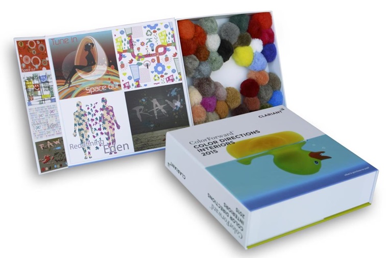
ColorForward Interiors 2015 presents a palette of forty colors, ten for each of four societal trends expected to influence consumers around the world. Each color is presented in polyamide or polypropylene fibers that are formed into pompons and stored in a presentation box that is decorated with illustrations representing the four trend themes. The pompons can be rearranged inside the box to create hundreds of combinations using strong, bright colors with complementary and contrasting neutrals and mid-tones.
"Fabrics and carpeting are usually made up of fibers of many different colors," says Alessandro Pozzati, ColorWorks Europe/IMEA Industrial Designer. "So, we provide our customers with a tool that invites them to be daring and unconventional. We offer them the possibility to play with the pompons, rearranging them to explore the almost infinite combinations available."
The four societal trends presented in ColorForward Interiors 2015 include:
Tune In Space Out
In the summer 2015, the Italian city of Milan will host Expo Milano 2015, which will be organized around the theme "Feeding the Planet, Energy for Life." The event will address the question of how mankind can feed itself in an environmentally, socially and economically sustainable way. The event takes place against a backdrop in which people are becoming increasingly anxious about the future of life on Earth. An expanding population, diminishing resources, overcrowding, technology overload are all leading us to yearn for some kind of escape, whether it is an internet-free, digital detox vacation or some future migration to another planet like Mars. Boredom becomes appealing, while silence is the ultimate luxury.
The colors that represent this theme are both other-worldly, including shades of orange and red representing the wind-blown sands of Mars, deep-space black, life-sustaining watery greens and blues and calming grays.
Live2Live
The Millennial Generation, including those born in the years between 1980 and 2000, has come of age. Although they have lived through decades that brought of global terror and economic struggle, they are also the participation-trophy generation. They have a high level of self-esteem and feel entitled to more from a life where employment is hard to find. Eagerness and impatience, combined with creativity and an entrepreneurial spirit, leads them to create an optimistic new world in which they are rewarded for innovation, empathy and altruism.
Playful, almost whimsical colors were selected to capture their spirit. Bright yellow and optimistic blues are matched with grayish green and warm reds and arrayed against a clean white background like a blank sheet of paper waiting to have the future written upon it.
Redefining Eden
Does it really benefit human beings to expect each and every one of us to fit into a preconceived and conventional scheme, rejecting the acceptance of human nature as a collection of infinite shades within the concept of a Person? The answer to this question, increasingly, is "No!" The concept of personal identity in the modern world is changing rapidly, especially when it comes to gender. Distinctions between genders are beginning to fade and there is fluidity in relationships that allows for same-sex marriage, stay-at-home dads, career-driven women and the increasingly common use of the pronoun ‘ze’ as an alternative to ‘he’ or ‘she.’ Unisexuality, which emerged first in the avant-garde society of Europe, is spreading globally.
Barriers are breaking down in the world of color as well, as masculine blues soften, delicate pinks become unconventionally warm and neutral beige and gray/purple hues fill in the middle ground.
Raw
Reacting to an over-protected, over-processed way of life, people are opting for a return to a more primal state of being. They reach inside themselves for power and inner strength. The disciplines of extreme sports, fitness and survivalism are embraced by the modern warriors, men and women, alike who wear blood and bruises as their new badges of courage. Consumers no longer want "normal;" they want a wider variety of "extreme" goods. Food, unprocessed and raw, is being embraced as fuel required to deliver the strength and endurance required achieve bold goals.
Blood red and a bright blue representing the life-giving element of oxygen are superimposed in this palette on top of earthy, primal colors like a vegetal green and mud brown, as well as mid-tones of light gray and darker slate.
