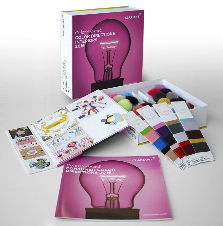
Clariant releases ColorForward® Interiors 2016: new materials appeal to broader fiber audience

- Full color palette presented in PP, polyamide and polyester fibers
- Trend-analysis and color-design tool continues to surprise and inspire designers, architects and manufacturers
- 2016 guide focuses on looking for the unknown, instead of repeating what we know
For the first time, the ColorForward Interiors portfolio includes not only pompons made of polypropylene (PP) and polyamide (PA) fibers, but also "wrap cards" with polyester fiber samples. The polyester fibers are produced as air-textured yarn (ATY), which is also commonly known by the old DuPont trademark, Taslan. ATY yarn is commonly used in the automotive industry and also in furniture upholstery and clothing. The pompons are made from bulk continuous filaments (BCF) to create a texture that is favored for carpeting made in Europe, the Middle East and North America. All fibers in ColorForward Interiors 2016 are dope dyed or spin dyed using Clariant masterbatches (color concentrates) to impart color to the yarn.
"Each year we have released ColorForward Interiors, we have received valuable feedback about how we can enhance the value for our customers," explains Francis Baud, Global Head of Marketing –Fibers for Clariant Masterbatches. "By adding wrap cards with polyester yarn, we are now able to show our colors in a form that will be very familiar to a broad spectrum of fabric producers, designers and interior decorators. At the same time, we have retained the pompons, which are very popular in the carpet industry."
ColorForward Interiors is derived from Clariant's groundbreaking ColorForward program, now celebrating its 10-year anniversary. ColorForward springs from the minds and experience of color, design, marketing and polymer experts, representing multiple creative industries from all over the world. Each edition presents four global societal trends that can be expected to influence consumer behavior. The international team then selects different colors or color combinations that evoke an emotional response related to each trend. Trends identified for 2016 include:
Liquid Minds... this theme springs from the idea that people have reached a point where slow evolutionary change has to give way to revolutionary innovation; where they walk away from the comforting embrace of nostalgia, trust their instincts, look at the world through new eyes, and take bold risks that open up new insights and great leaps of innovation.
One of the colors in Liquid Minds is an aqua blue called Be Water. It was inspired by martial artist and actor Bruce Lee who said "Be like water making its way through cracks. Do not be assertive, but adjust to the object, and you shall find a way around or through it. If nothing within you stays rigid, outward things will disclose themselves."
Oh, my go(l)d... an unapologetic acknowledgement that excess can lead to unique pleasures, whether one is a super-rich celebrity or a fan who follows them through social media, "people" magazines and reality TV. Like it or not, outlandish, gaudy baubles and outrageous behavior is "in".
These colors are classy and brash, all at the same time. Don't Touch My Jelly Shot! is a lime green, and gold, naturally, is called You Cannot Afford Me.
Love... is spelled with a Wi-Fi symbol inside the 'o' to represent the ways in which technology and human life have merged. Immersed in the cloud, wirelessly connected sensors track personal health and even create new connections between people. We access medical information, monitor vital signs and depend on devices to help carry out even the simplest of tasks. Technology has become an invisible, yet caring, family member.
The colors in this palette are warm and comforting, ranging from the soft, brown Teddycare, to a bluish grey silver called Invisible Attraction and a coral pink named Cora(l)zon.
Work It Girl... this theme points to a new kind of feminism that ignores stereotypes about what is feminine and what it means to be empowered. It is about having the freedom to be what you want to be. Women today don't feel the same need to limit themselves the way they used to. The power of the Internet and all those other social connections are giving women a stronger voice and they are using it to create new definitions of what it means to be female.
The colors in this grouping range from a flaming red/orange called Kiss My..., the cheekiness of The Bush Is Back, a brand-new multicolor effect that encapsulates tiny fibers of pink and black in a transparent matrix, and also a soft, transparent pink to affirm that you no longer have to be embarrassed to show your femininity.
There are five colors representing each trend and they are reproduced in a total of 20 pompons. There are also four wrap cards, with each card holding fibers of all five colors of the four trend groups.
"Fabrics and carpeting are usually made up of fibers of many different colors," says Alessandro Pozzati, Industrial Designer, ColorWorks Europe/IMEA, Merate, Italy. "The wrap cards show designers a visible combination of colors so it is possible to see how the different hues of each palette might work together. This same mix-and-match effect can be achieved by grouping the pompons."
"The fiber and textiles market is very diverse," points out ColorWorks designer, Judith van Vliet, "and there are ideas and colors in ColorForward Interiors to provide inspiration for any of the sectors. For instance, the new neutral shades in the Liquid Minds palette and the warm, soft colors of Love probably will appeal to automotive fabric designers who may not have considered these shades before. On the other hand, brighter colors with electric hints – like Don't Touch My Jelly Shot! in Oh, My Go(l)d – can liven up sport goods. Really, there is something here for everyone."

