Typography
Our typography is based on the Clariant corporate font Gotham with its modern grotesque typeface. The sans serif font is readable on screen and on print material, even in small sizes. It brings formal clarity into every communication. Two fonts within the Gotham family are used: Gotham and Gotham Narrow.
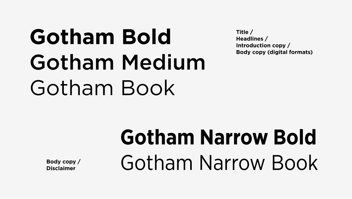
Gotham is used for titles, headlines, and introduction copy. It is easy to read and optimized for both print and screen applications. The Gotham font is used in three different styles: Bold, Medium and Book.
Gotham Narrow is used in print applications mainly for body copy. The space-saving font is easy to read even at small sizes. The Gotham Narrow font is used in two different styles: Bold and Book.
TYPOGRAPHYFont hierarchy
For print and digital publications, font sizes are defined for the different text formats that are used in the layout. A simple font hierarchy create more clarity and impact in the communication throughout the touch points.
Division Level and Category Level
Print formats
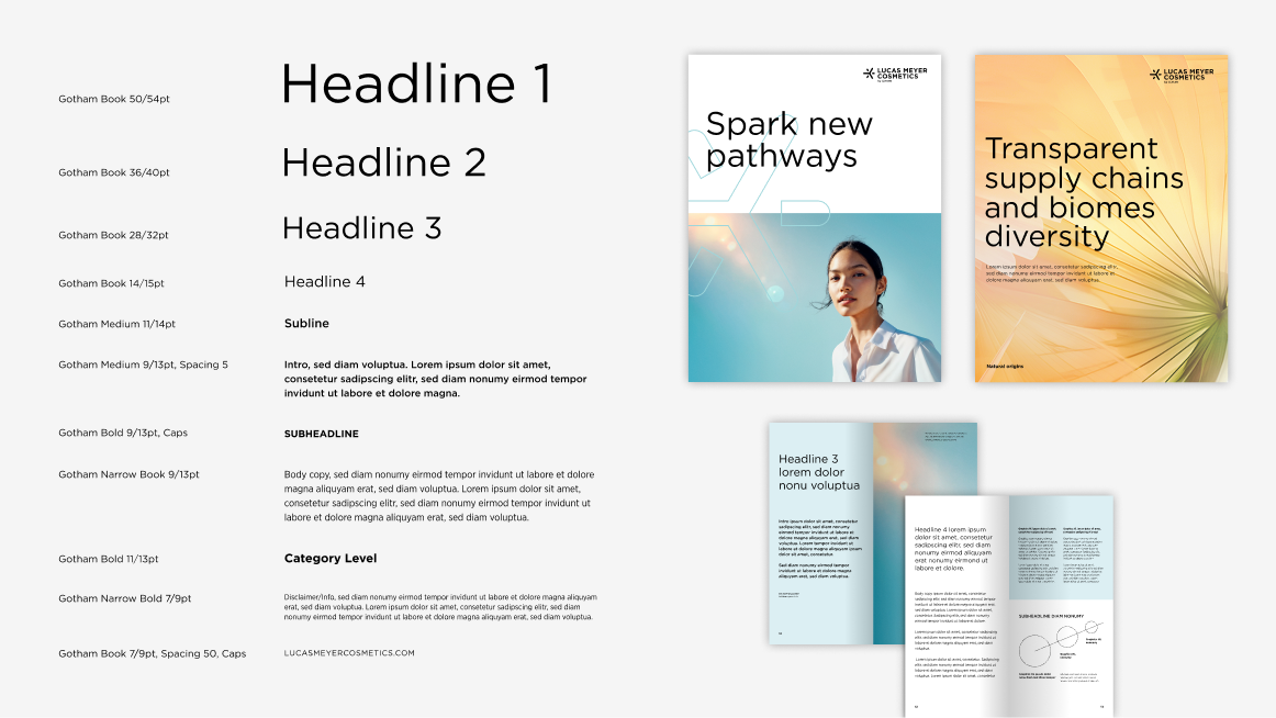
The listed font sizes are for the A4 and US letter formats.
Digital formats
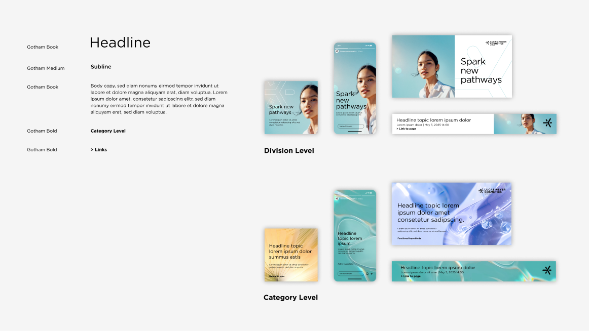
Font sizes are based on Clariant's templates for online advertising and social media.
Read more about the typography on Division Level
Read more about the typography on Category Level
Product family level
Print formats
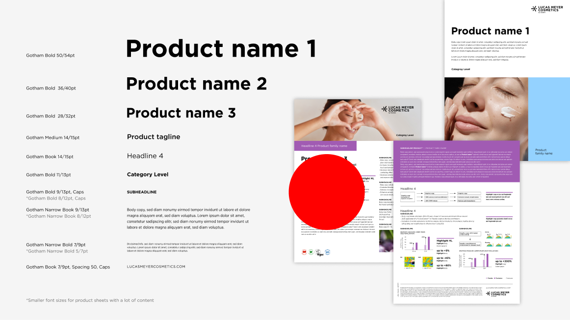
The font sizes listed are for the A4 and US letter formats.
Digital formats
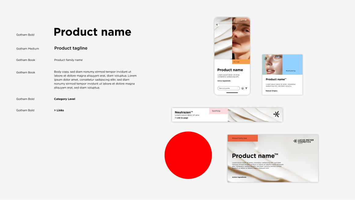
Font sizes are based on Clariant's templates for online advertising and social media.
TYPOGRAPHYFont principles
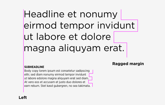
Left-aligned and ragged right Text is generally left-aligned and ragged right. Right-alignment is permitted for table text, page numbers, and margin text.
Mixed case and capital letters The standard for text is to use a mixed case, with both upper case and lower case letters. Capital letters are mainly used for the subheading.
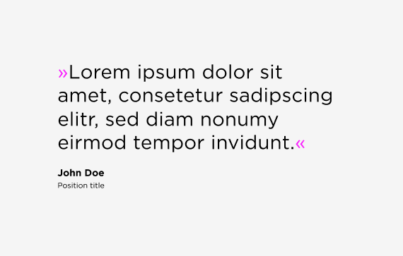
Guillemets
Quotation marks are used in the text for points of emphasis, relevant statements, or quotes. We use the elegant version of quotation marks known as »guillemets.« Due to their shape, they have less air around them, which means they don’t create disturbing gaps in the text.
Color
Text is always black or white – it must never appear in another color. Use black text on light backgrounds and white text on dark backgrounds. For the solid color backgrounds (color area), the corresponding font color is predefined, see the table in the color chapter.
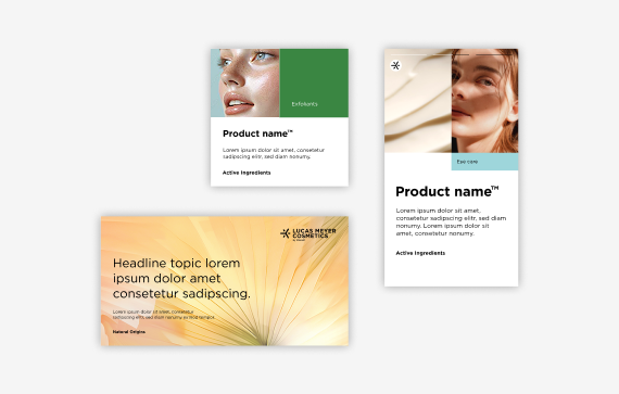
Placement
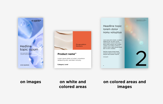
Typography can be placed on white or plain color backgrounds (color area) and on calm images, provided there is enough contrast to ensure readability and clear differentiation of information.
TYPOGRAPHYSystem font
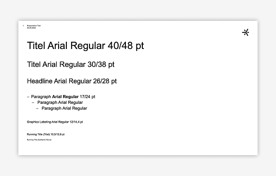
For office and web applications, we recommend using the cross-system font Arial. The font can be used in two styles: Arial Regular and Arial Bold. Arial Regular is used for titles, headlines and body copy, Arial Bold to highlight an important body copy text. For the PowerPoint Master template, different font sizes are defined to make it easy to read.
Exceptional case: If you need a serif font in for legal documents or correspondence, you can use the Georgia font as a fallback.