

Layout system on hierarchy levels
This chapter defines the application of the Lucas Meyer Cosmetics layout system on Division, Category and Product Family levels.
LAYOUT SYSTEMDivision Level
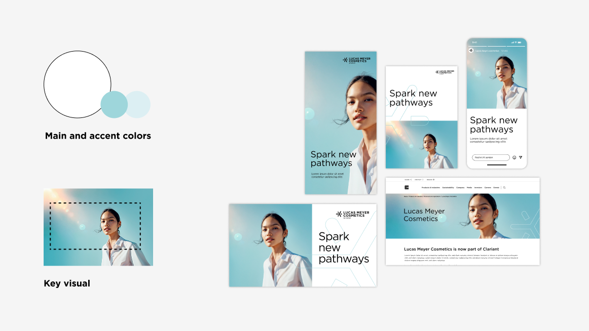
Grid options
- No division: Full-surface image
- Two-part division: Content and image area
Headline
The Gotham Book font used for the headlines creates a distinctive visual impression. It brings both clarity and lightness to the design and creates a modern look.
Key visual
The key visual can be used across the entire surface or in combination with the white content area. They visual is designed to be used across various media – adaptable to portrait and landscape format. It can be cropped to best fit the application. Note the defined focus area (dotted lines in the figure above). A »narrow« version is also available for very narrow formats.
Colors
At the Division Level, white is the main color, with turquoise accents. The darker shade is used alongside white for the Outline Sparks. The lighter turquoise is exclusively used on the secondary information level. It can be applied, for example, as a background for chapter dividers or infoboxes in print media, as well as for footer colors in digital spaces.
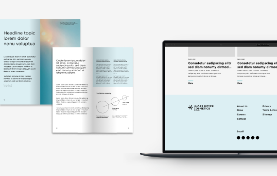
Outline Spark
The Outline Spark can be used as an optional branding element at the Division Level. It has no fixed position and can be scaled. This outline visual can be placed either on the image or the content area, or it can overlap both. It should always be cropped and never fully visible. Avoid covering the logo or faces, and ensure the Outline Spark is used on images that are not too cluttered, so it remains recognizable. Attempt to maintain a harmonious balance between the image, content and Outline Spark.
Use the Outline Spark only for Division Level.

LAYOUT SYSTEMCategory Level
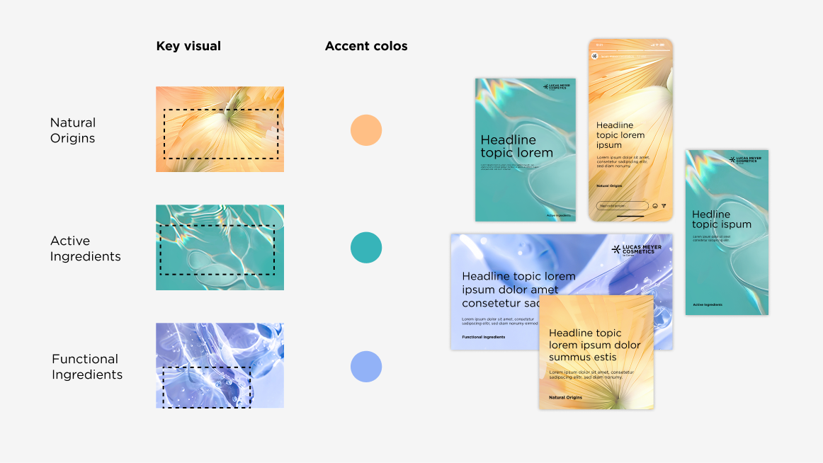
Key visual
There are three main product categories, each represented by an abstract key visual. The category visuals are used over the entire surface. The visuals can be rotated, mirrored and scaled freely according to the application. Note the defined focus area (dotted lines in the figure above).
Colors
Since the focus at the Category Level is on the large-scale use of the key visuals, there is no main color. Instead, each category has a specific accent color. This accent color is used exclusively on the secondary information level, such as for infoboxes. The use of accent colors is kept subtle.
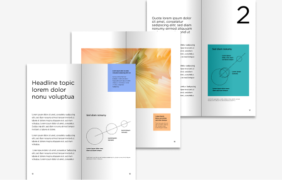
LAYOUT SYSTEMProduct family level
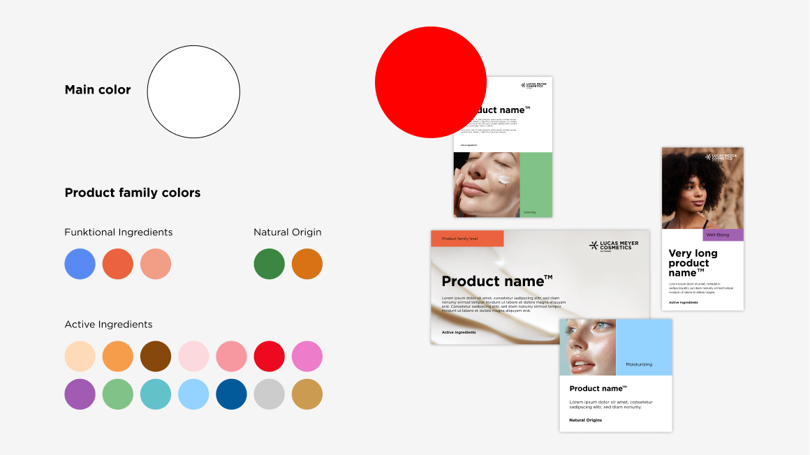
Grid options
- No division: Full-surface image (incl. small flag)
- Two-part division: Content and image area (incl. small flag)
- Three-part division: Content area, image area and large flag
Product name
Is prominently displayed in Gotham Bold.
Imagery
It is important that the images immediately adjacent to the flag or color field visually harmonize with the color of the product family level. However, it is not necessary for them to reflect the same colors.When placing the logo and text on the image, make sure that the corresponding areas are calm and have sufficient contrast.
Colors
Each product family has a defined main color. For graphics, there is a further color gradation for each main color. In the case of graphics, there is an additional color shade for each main color.
Content hierarchy
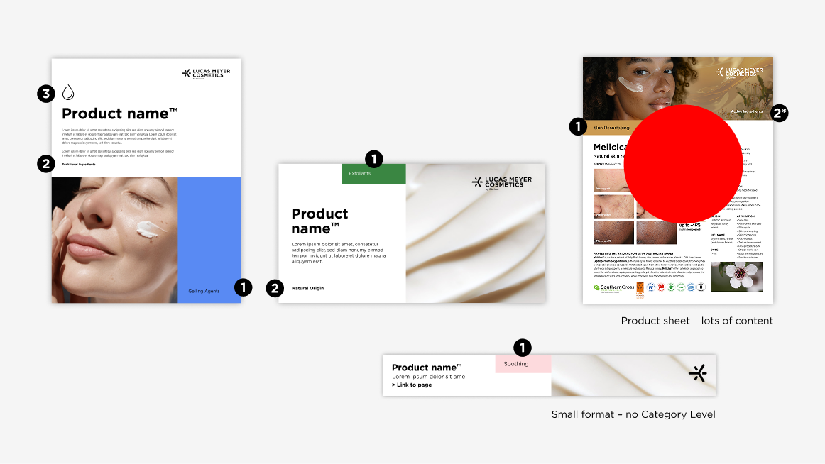
1. Flag
2*. Category Level
- Communicates the product family
- Color: Product family
- Placed on image
- Color black or white: dependent on the image
2. Category Level
- Marked as binder
- Placed: at the bottom of the page
- Color: black
- Please note: For very small formats, no Category Level is listed
3. Icon
- Optional
- Color: black
4. Information area
- Marking highlights
- Color: Product family
Product communication – From reduced to bold use of color
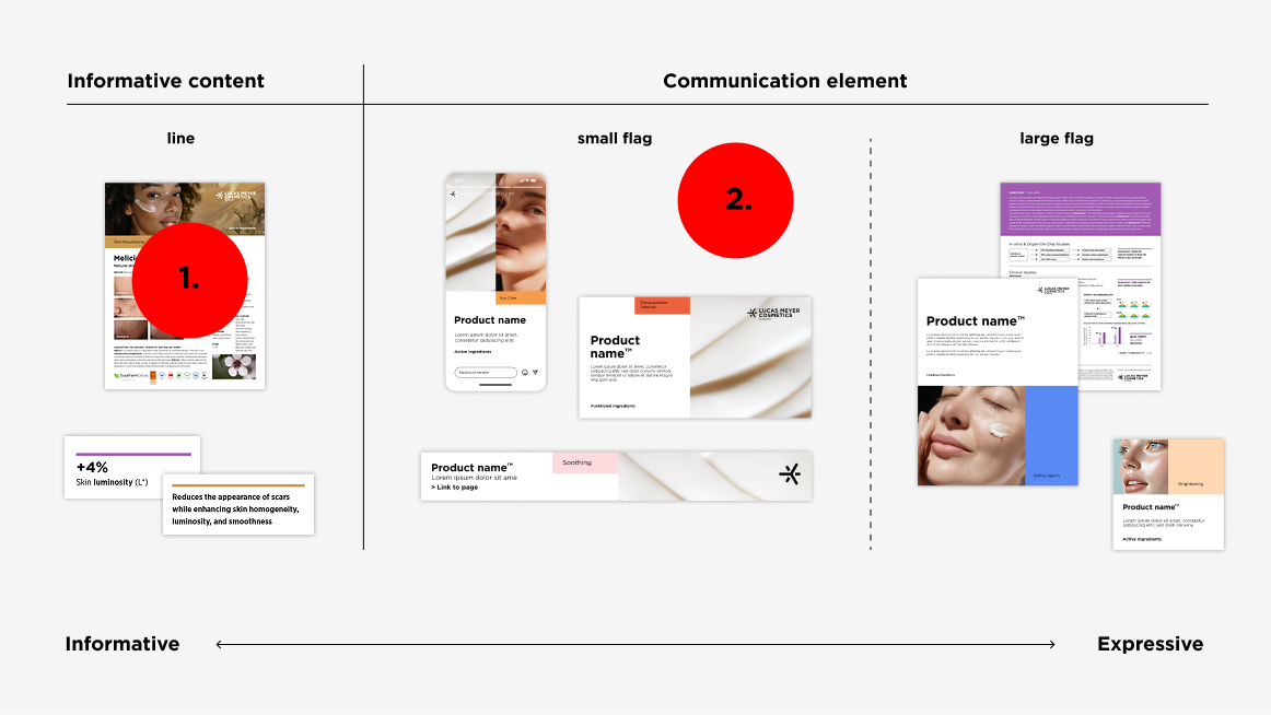
For structuring product communication applications, the layout system offers a wide range of possibilities. Divide the format in a way that it fits your message, depending on the content, touchpoint and context. For a more bold and emotional impression the three-part division with the prominent large flag is the right choice. In contrast, a two-part division with a small flag should be used when a lot of information is placed on a format.
There are three types of flags: the large flag, the small flag, and the line. The line represents the most reduced form, the smallest unit of the flag. It can be used to subtly emphasize important information without cluttering the layout.
Large flag - Print and digital formats
Typography:
- Gotham Book, left-aligned
- Distance to the edge: 2 B-Units (corresponds to the margin of the format)
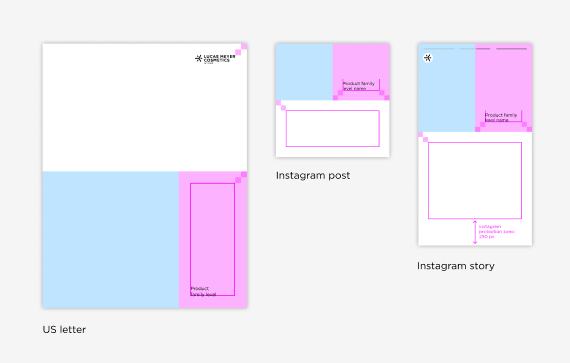
Small flag - Print formats
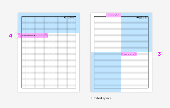
- Flag height: 4 lines
- Flag width: about 1/2 format width, aligned with the column grid
- Typography: Gotham Book, left-aligned
- Typography placement: centered vertically with 2 B-Units to the right and left
Differences if space is limited:
- Flag height: 3 lines
- Flag width: about 1/2 of the content area
- Typography placement: 1 B-Unit to the right and left
Small flag - Digital formats
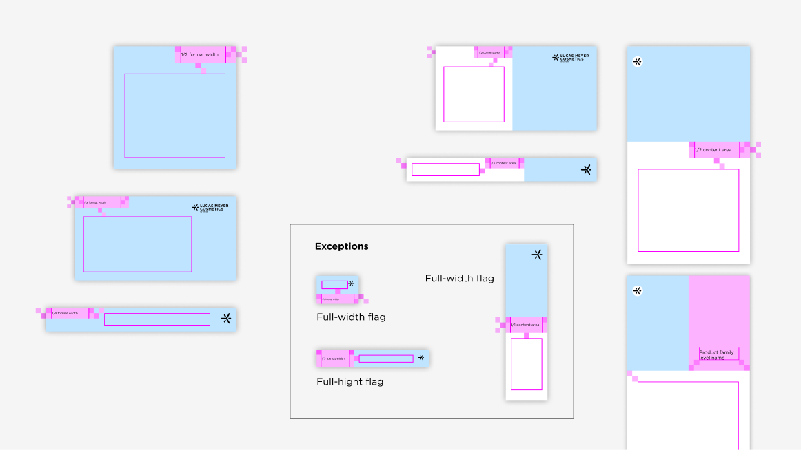
Flag width – No division layout
- 1/3 of the format width: Rectangular format
- 1/2 of the format width: Narrow format width
- 1/4 of the format width: Narrow format height
Flag width – Two-part division layout
- 1/2 or 1/3 width of the content area
- 1/1 of the format width: Extreme narrow small format width (Skyscraper)
Hight:
- 3 B-Unit
- 2 B-Units: Small formats / formats with narrow format height
- 1/1 of the format hight: Extreme small formats with narrwo format height
Typography:
- Gotham Book, left-aligned
- Placement: centered vertically with 1 or 2 B-Units to the right and left
The line
The line in print formats
Size:
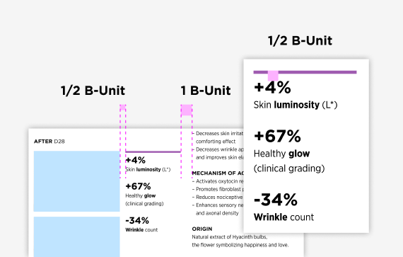
- Hight: 1/6 B-Unit
- Width: Orientation on the column grid
Placement:
- Orientation on column and baseline grid
- Distance from line to information text: 1/2 B-Unit
- Distance from line to image or text module: 1/2 or 1 B-Unit
Typography: left-aligned with the line
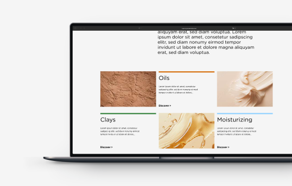
The line as a digital element