
Our flexible layout system
Our flexible layout system is crucial for creating and maintaining a visually appealing and cohesive appearance across various media and formats. The design system of Lucas Meyer Cosmetics aligns with Clariant’s principle of clarity, characterized by a simple and clear structure of formats. It is scalable, allowing for adaptable layouts for a wide range of applications, thus providing a high level of flexibility. This principle builds the foundation for all layouts – wether emotionally bold or clearly reduced.
LAYOUT SYSTEMOur three hierarchy levels
We communicate through different levels to reach our customers and place our solutions – from the Division Level, to tell the stories of our Company, over our Category Level, which includes the Product Families, to, finally the products.
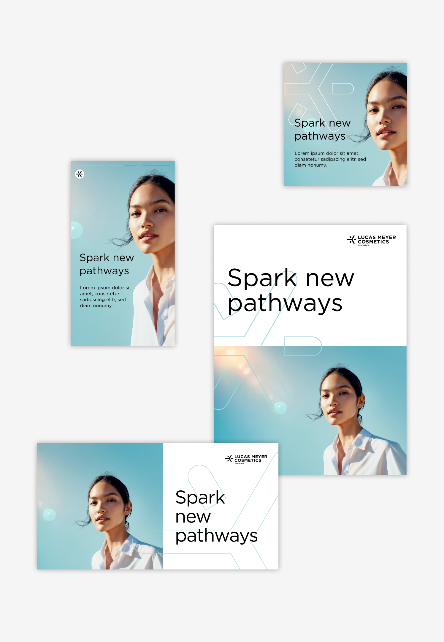
Division Level
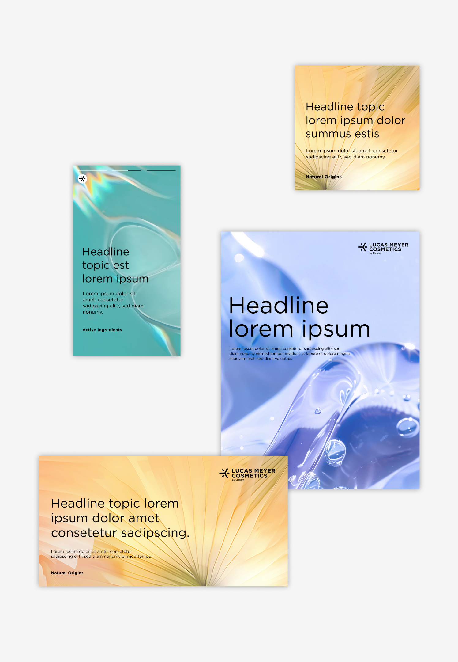
Category Level
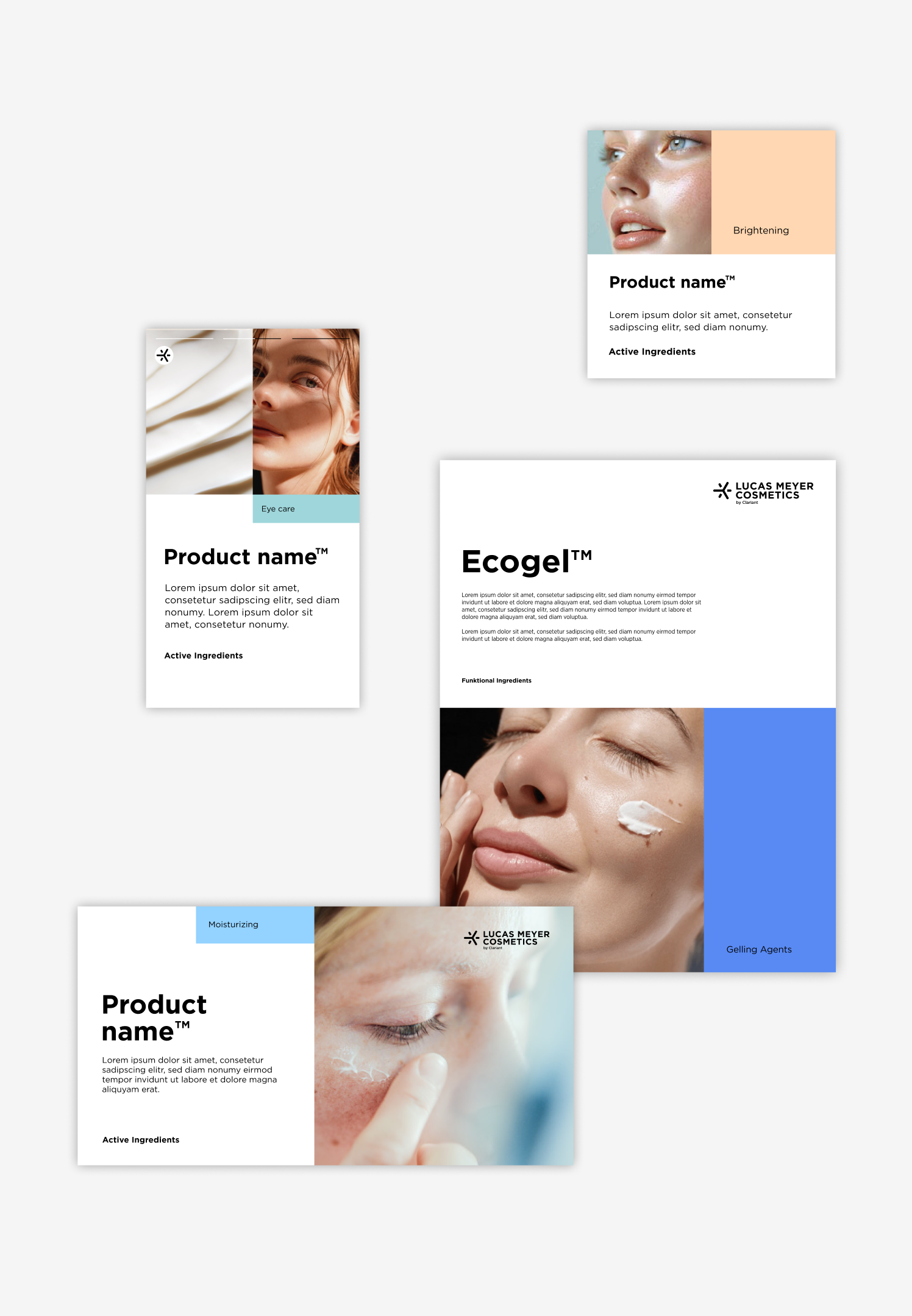
Product Family Level
LAYOUT SYSTEMThe Base-Unit
Base-Unit builds the foundation for our layout grid.
The Base-Unit works as an orientation for sizes, proportions and distances. A simple system – it offers a lot of flexibility and still provides a clear structure for all the different applications (digital/print).
Base unit is abbreviated as B-Unit in the following.
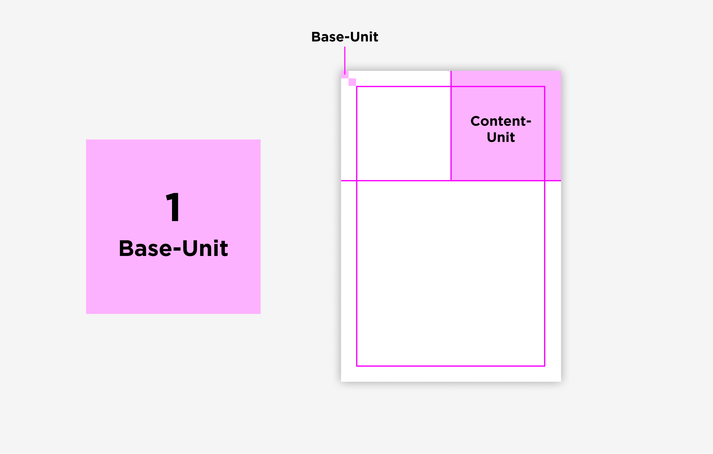
The Base-Units can be used in many ways
- The logo width is 9 B-Units.
- 4 B-Units is the optimal distance and 2 B-Units the minimum distance between text and logo.
- Use 2 B-Units as a reference for the page margin.
- Images should respect a distance of 1/2 B-Unit between each other.
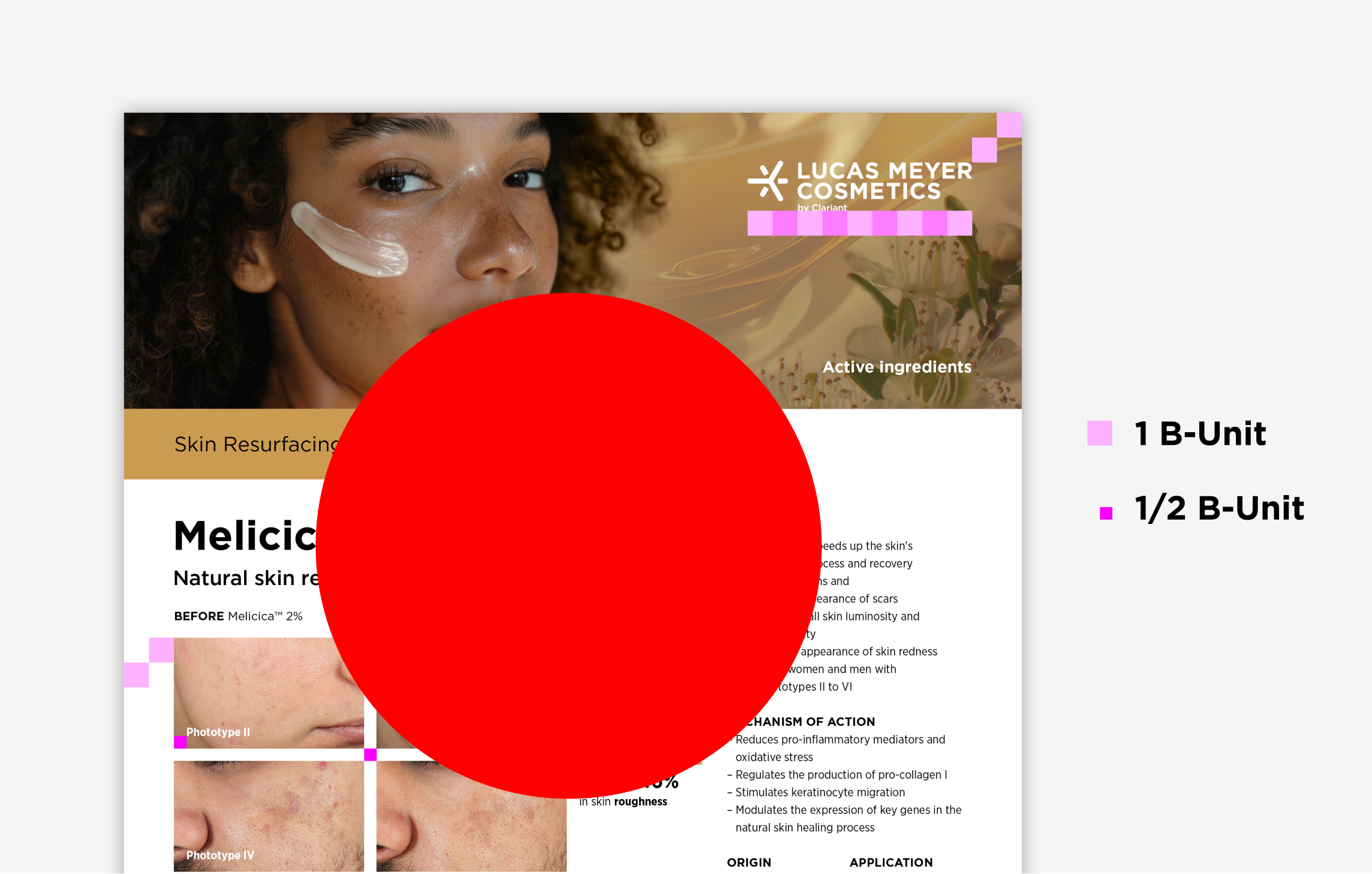
The Base-Unit is predefined
Print formats
DIN formats and US letterDigital formats
Online advertisingDigital formats
Social mediaA0 34 mm 980 × 350 px 24 px YouTube Thumbnail 24 px A1 17 mm 728 × 90 px 20 px LinkedIn and X 30 px A2 12 mm 160 × 600 px 20 px Instagram Post 48 px A3 8.5 mm 300 × 250 px 20 px A4 and US letter 6 mm 120 × 80 px 16 px A5 and DIN long 4.5 mm 320 × 50 px 14 px Print formats: As a rule of thumb, use the diagonal of the format, divide it by 60, and round it up to the nearest 0.5 mm.
Minimum print size: 3.5 mm
Minimum digital size: 14 px
LAYOUT SYSTEMThe logo
Always in the top-right corner
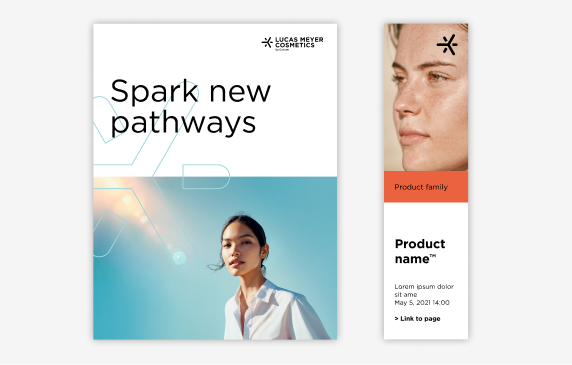
For a strong branding, use the standard Lucas Meyer Cosmetics logo. The logo is always in the top-right corner of the layout. Ensure enough white space between elements so the logo to stand on its own. The optimal distance between logo and content is 4 B-Units and the minimum is 2 B-Units. For extreme formats such as banners, it is possible to adjust to 1 unit.
The Single Spark is only used in narrow digital formats when there is a lack of space. It will also be placed in the top corner of the format. The ideal distance between the Spark and the content is 2 B-Units, with a minimum of 1 B-Unit.
See the logo chapter for more information on logo size.
LAYOUT SYSTEMThe grid
The Content-Unit structure the layout
The proportions of the Base-Unit is the foundation of the Content-Unit. The Content-Unit is scaled within the format. Its size is used as a measure to define the proportion of the design areas – content and image area. The Content-Unit helps to structure the layout to ensure clear compositions and a unified appearance. The simple system allows the creation of variable layouts for different formats with individual heights and widths.

No subdivision
The format is not sectioned. The content is placed on a full-surface background image.
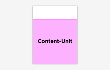
Two-part division
The format is divided into image / color area and content area.
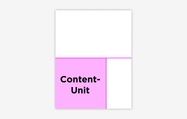
Three-part division
The layout is split into three areas - image and content area + X. The X can be a second image, a color area or the big flag.
Print formats
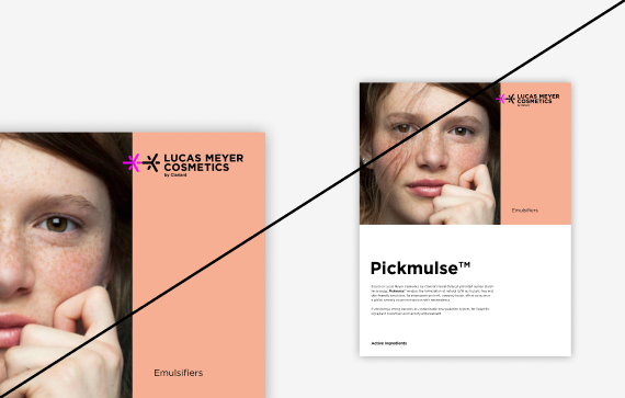
For DIN and letter portrait format the Content-Unit defines the height of the image area / color area. For more variety, the composition can be mirrored vertically. Below you will find the main division options.
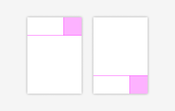
The Content-Unit is 1/3 of the format width
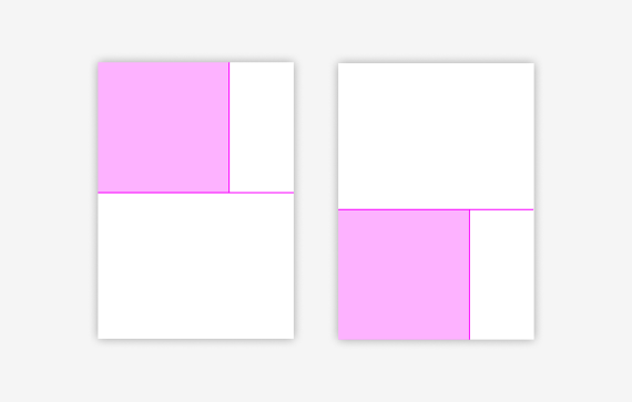
The Content-Unit is 2/3 of the format width
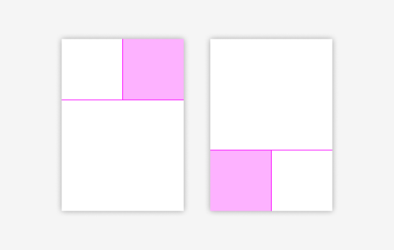
The Content-Unit is 1/2 of the format width
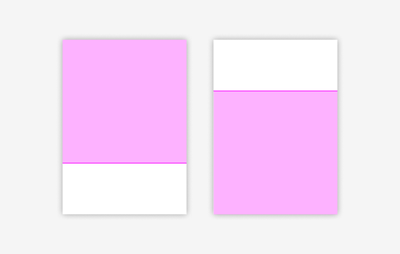
The Content-Unit is 1/1 of the format width
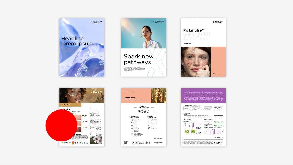
Please note: If the cover is divided into three parts, make sure that the area of the division does not interfere with the logo protection area.
Digital formats
The Content-Unit defines the image and content area, depending on the format.
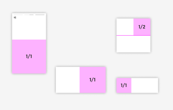
The Content-Unit is 1/1 or 1/2 of the format width / hight
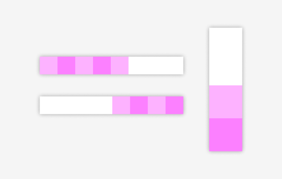
Narrow formats: If you have a narrow format, apply the Content-Unit multiple times (vertically or horizontally) to build the layout.
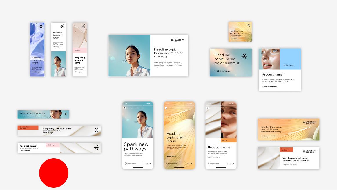
Focus on message or image
You can use the dimensions of the unit for the image or the content area on whether you want to focus on the image or the message. The logo (or Single Spark) is positioned in the same place.
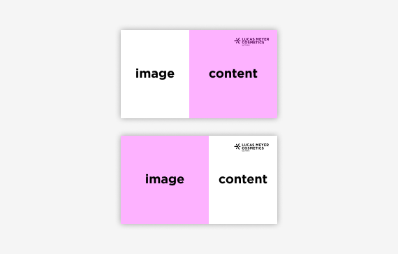
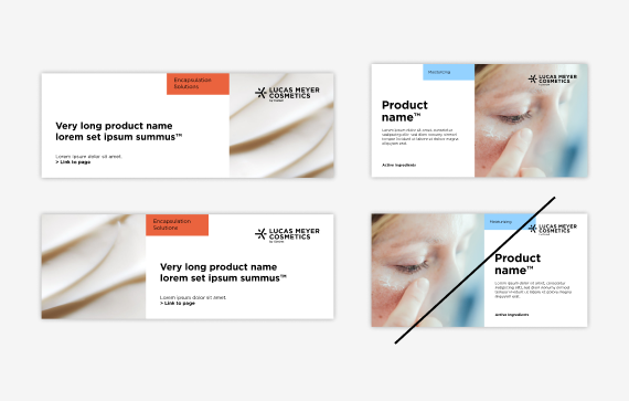
Layout mirroring landscape format
The ideal distance between the Spark and the content is 2 B-Unit, with a minimum of 1 B-Unit.
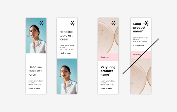
Layout mirroring narrow portrait formats
For extreme portrait formats the distance between the Spark and the content can be reduced to 1 B-Unit.
LAYOUT SYSTEMPage margin
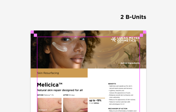
Normal formats: The page margin for normal formats is 2 B-Units.
Minimum margin size print: 4 mm
Minimum margin size digital: 14 px
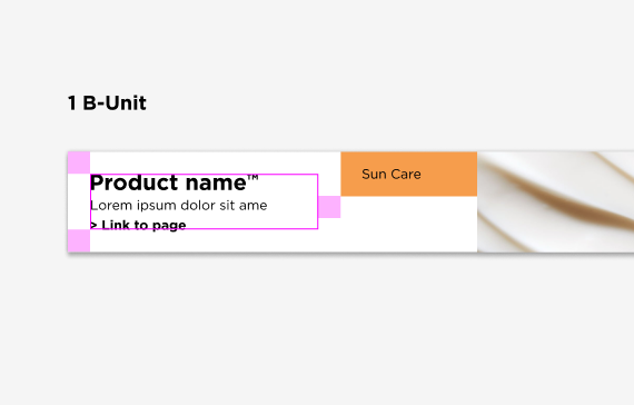
Extreme formats: For extreme portrait or landscape formats in digital applications, the page margin can be reduced to 1 B-Unit.
LAYOUT SYSTEMText grid
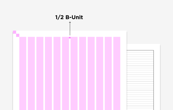
Pages are structured by a column and baseline grid. Texts and tables are aligned with these. On inside pages, they also provide guidance for image placement. The text grid has 4, 6 or 12 columns, depending on the use, medium, and format. The space between the colums corresponds to half of the B-Unit. The division of the baseline grid corresponds to the line spacing of the copy text. Measured from the top of the page, the baseline grid begins at the top of the content area.
For very large formats such as trade fair content walls or digital formats with their short, focused content, no additional text grid is needed. The text is placed within the content area and under the guidance of the unit system.
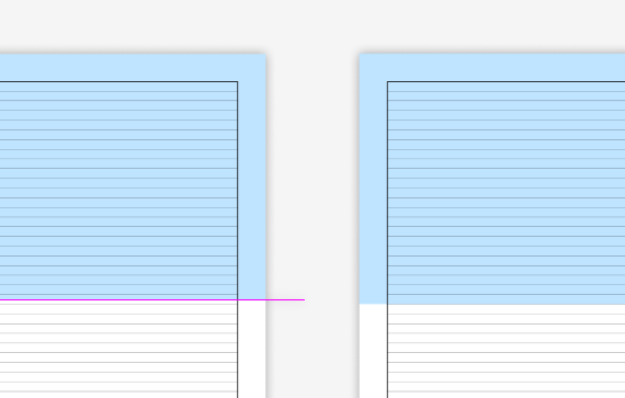
Adjusting the division to the baseline grid
Depending on the format, the subdivision (image area / color area) may not always end on a baseline, and will need to be adjusted manually to fit. In the case of text binding, care should be taken to ensure that the edges of the split areas are aligned with the nearest baseline.
Distance from text to image / color area
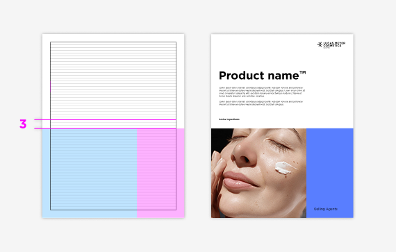
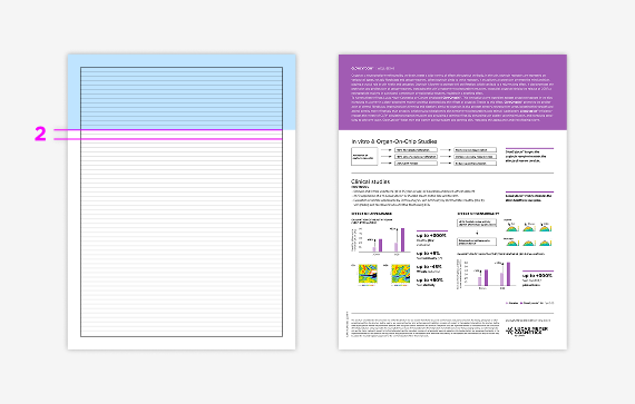
The optimum spacing is three blank lines. For product sheets with a lot of content, the spacing can be reduced to two blank lines.
Lack of space