
Our Logo
The logo is build by the word mark Lucas Meyer Cosmetics and the picture mark with its characteristic shape, the Spark. It defines the main sender in all our touchpoints and communicate our strategic approach to enter the future of chemistry. The logo is available in two colours – black and white – to become recognizable on any background.

Black logo version
White logo version
LOGOSpark
For smaller digital applications, the picture mark can be used on its own. It makes an impact with its highly recognizable shape, which is ideal to create a consistent brand appearance across all channels. The Single Spark is also available in two colors: the black and white version. Choose the version that creates the best contrast against the background. Only in motion design, a transparent version is in use.
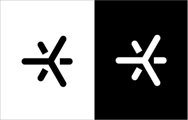
Color: The Spark can be used in white and black.
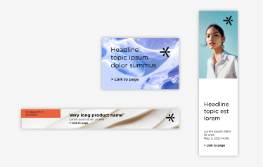
Size: The use of the Single Spark is intended for small digital formats
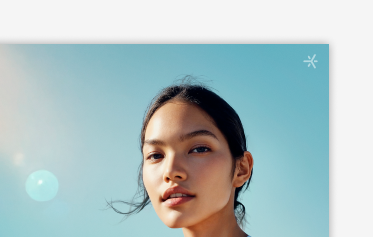
In motion design: The Single Spark is used as a corner bug with a size of 60 x 60 px. Here, transparency is used to put the focus on the content, in this case the movie clip
LOGOSizes
Standard logo width
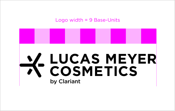
Picture and word mark are always related to each other and should be depicted together in any layout. In exceptional cases only, the picture mark (Single Spark)) can be integrated separately. The logo width is 9 Base-Units.
Print formats
- A0: 306 mm
- A1: 153 mm
- A2: 108 mm
- A3: 76.5 mm
- A5: and US letter: 54 mm
- A5 and DIN long: 40.5mm
Digital formats
- YouTube Thumbnail (962 x 540 px): 216px
- LinkedIn and X (1200 × 627 px): 270 px
- Online advertising (980 × 350 px): 216 px
Minimum size print with “by Clariant”: 40.5 mm
Minimum size print without “by Clariant”: 28.7 mm
Minimum size digital with “by Clariant”: 200 px
Minimum size digital without “by Clariant”: 132 px
Single Spark - for digital applications only
The Single Spark is used only for digital applications in extreme small/wide formats.
Online advertising:
- 160 × 600 px: 40 px
- 728 × 90 px: 40 px
- 300 × 250 px: 40 px
- 120 × 80 px: 16 px
- 320 × 50 px: 16 px
Minimum size: 16px

LOGOProtection zone
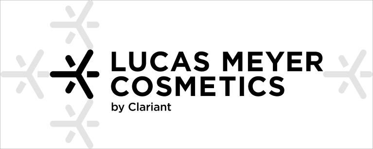
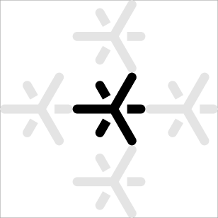
The minimum protection zone of our logo is the size of one Spark to each side of the logo. This applies, when using the Single Spark, as well.
LOGOAlignment
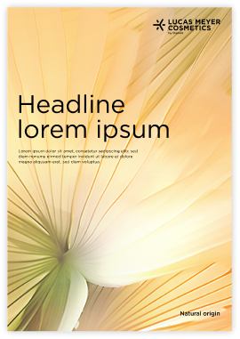
The logo is aligned to the top right corner of the layout with a 2 Base-Units distance to the edges. It will be at the top edge of the capital letters.

LOGOUsage of logo and Single Spark
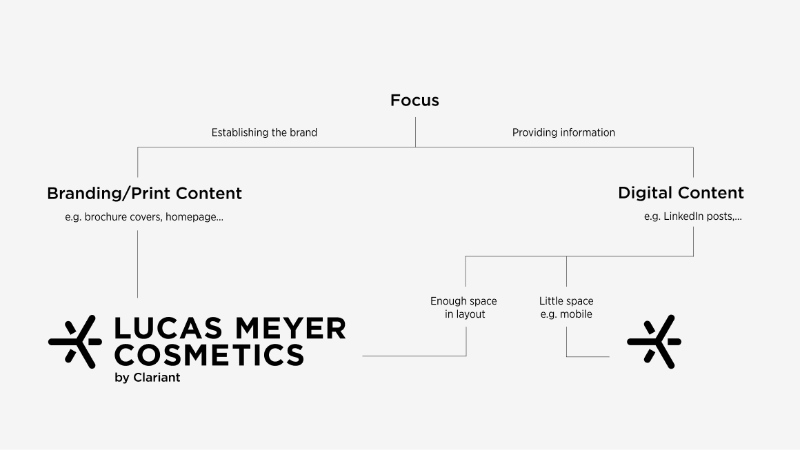
The decision tree below helps to make a decision for the usage of the logo or the Single Spark in the layouts. Try to avoid “over-branding”. If the brand needs to appear multiple times (e.g. on surfaces of a trade fair), use the Spark as well.
Here are some supporting questions as a guidance:
- Where is the logo used?
- In print or digital?
- Is there enough space (and clear space)?
- What is in focus?
LOGOSocial media profile logo
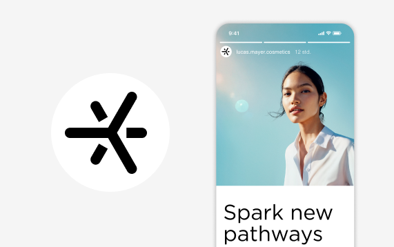
Our social media profile logo shows only the Single Spark because it makes a bigger impact in a smaller space than the regular logo. This helps with long-term brand recognition as everyone who lands on our Instagram page is quickly introduced to our brand.
LOGODon’ts
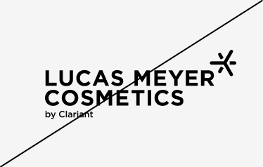
Don’t rearrange the word mark Lucas Meyer Cosmetics and the Spark picture mark.
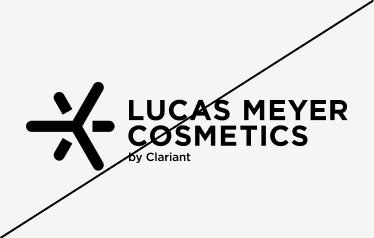
Don’t scale the elements independently. The logo is a unit and keeps its proportion while scaling.
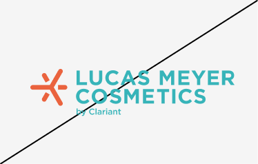
Only use black and white for the logo. For maximum clarity, we only use these two versions for the logo. Mixing colors or recoloring single elements should be avoided.
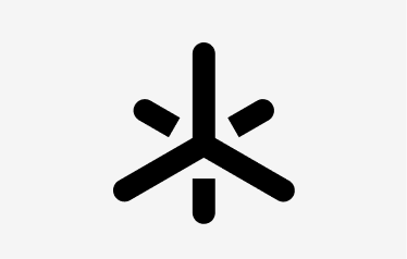
Don’t rotate the solid & outline Spark.
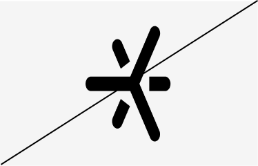
Don’t stretch the solid & outline Spark. When resizing the picture mark, make sure that it is scaled proportionally.
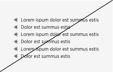
Don’t use the Spark as a decorative element.